by Eldric Vero
May 14, 2024
This CotD was inspired by Clare Pain, an Australian medical journalist and statistician, from the website Excess Death Stats “Why Have There Been So Many Deaths in Denmark?” (see link: https://www.excessdeathstats.com/denmark/ ). From the article: In 2022, the death rate in Denmark was 7.8% higher than it was for the five pre-pandemic years, our analysis of data from Statistics Denmark shows. And in 2023 the death rate was still abnormally high – 5.6% above the pre-pandemic rate. You might ask whether it is unusual for the death rate to be 7.8% higher than normal, as it was in 2022? Well yes, it is.
The author of the CotD has combined analyses of Covid-19 and Excess Deaths (all causes) as these are related.
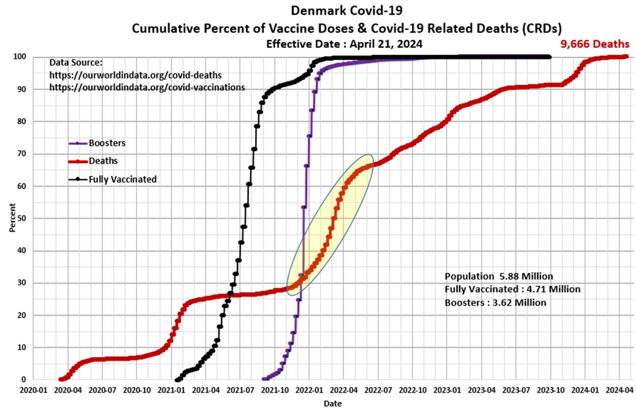
Panel 1 The first graph is a construct by the author as a standard CotD presentation which illustrates Covid-19 Related Deaths (CRDs) and vaccinations. Denmark’s CRD rate was relatively high immediately upon announcement of the SARS-CoV-2 pandemic in March 2020 and then “flattened” during the summer months (pre-vaccination). However, heading into the winter months of 2020/21, the CRD rate once again took-off as would be expected for a corona virus in the northern latitudes. The vaccination program started in January 2021 with high injection uptake rates to year-end 2021. The vaccine appeared to be effective as the CRD rate “flattened” in mid-2021 after about 30 percent of the population had been injected. The Booster program was initiated in September 2021 with a highly accelerated uptake rate into Q1/Q2 2022 with a notable increase in CRDs (high-lighted yellow). The CRD rate has declined somewhat since mid-2022 in concert with a waning vaccine uptake. Note the CRD rate profile since April 2023 is very similar to that of Sweden (see May 4th CotD).

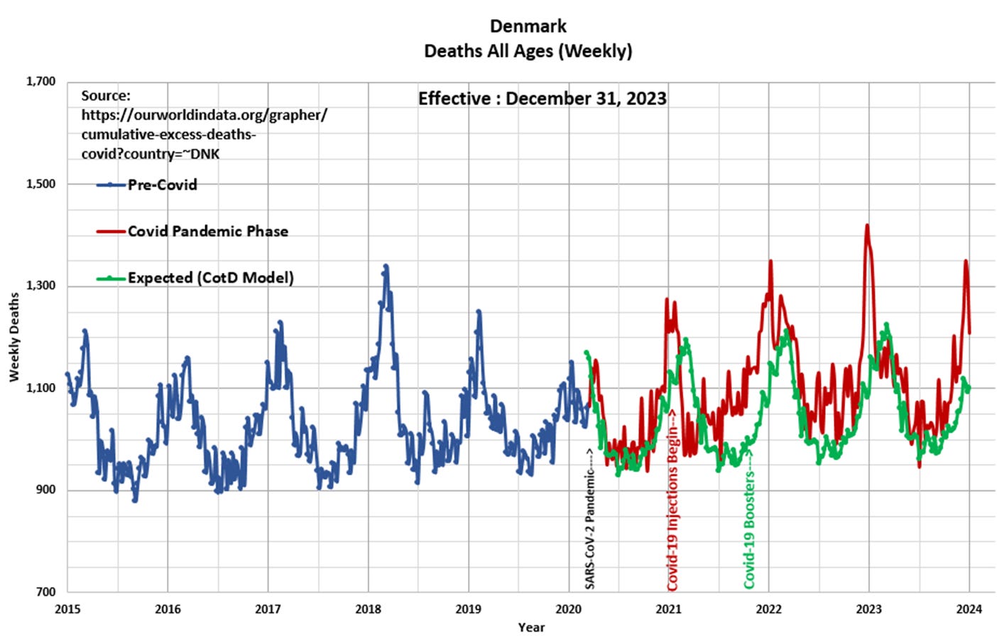
Panel 2 Observe the characteristic cyclical nature of deaths or all-cause mortality since 2015. The “Blue” line represents data prior to March 2020 and the “Red” line represents data since the SARS CoV-2 pandemic was initiated in March 2020. The “Green” line represents the “Expected” deaths (CotD Model) based on historical averages. The author has utilized the data for the five year period January 2015 to December 2019 in order to calculate an average normalized curve for Monthly Deaths. The Expected Deaths (CotD Model) incorporates an average 2.3 percent growth factor which appears to be a good match to the overall pre-pandemic trend.

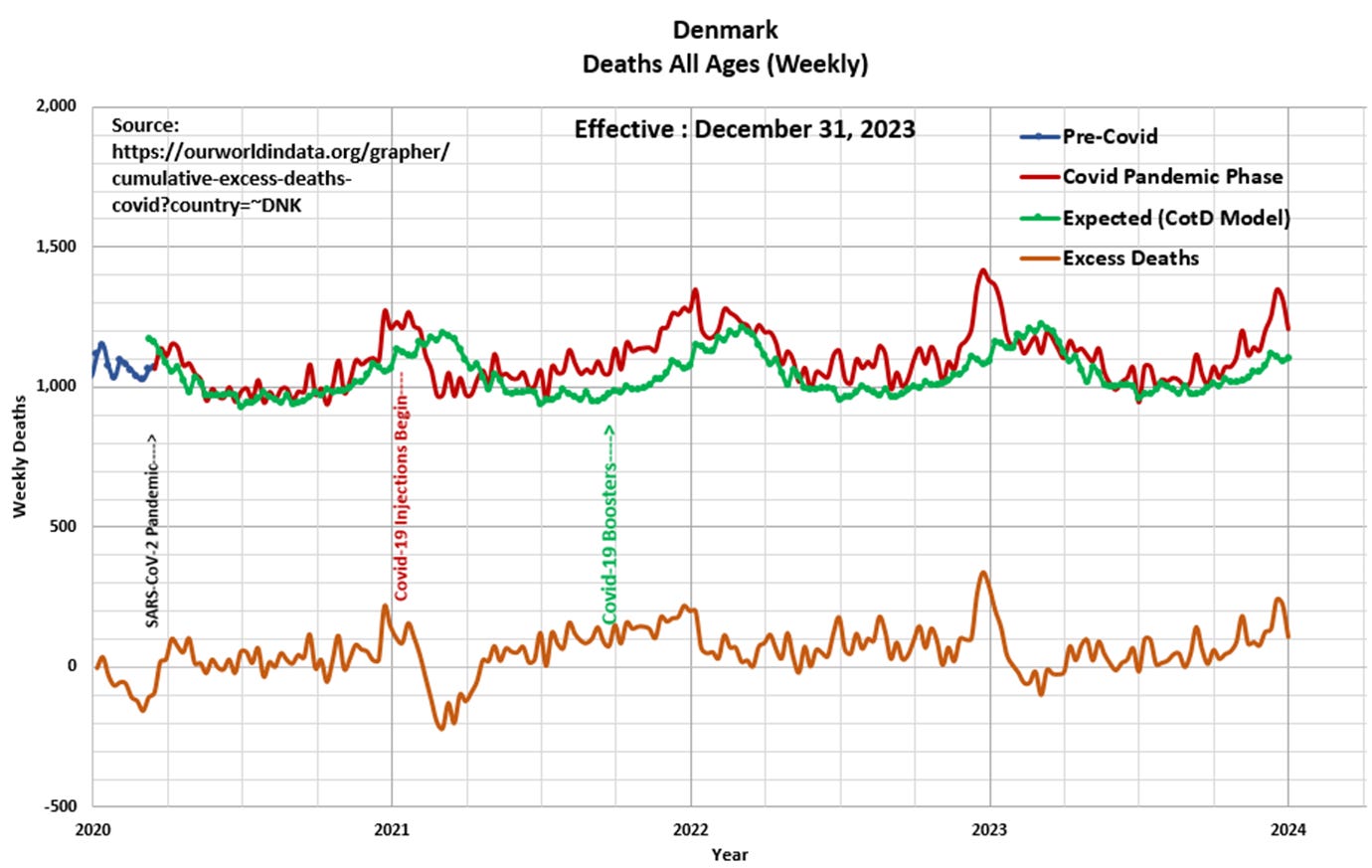
Panel 3 This presents the magnified portion (January 2020 to December 2023) of the graph in Panel 2. The “Orange” line represents “Excess Deaths” which is calculated by subtracting Expected Deaths (CotD Model) from Official Deaths.

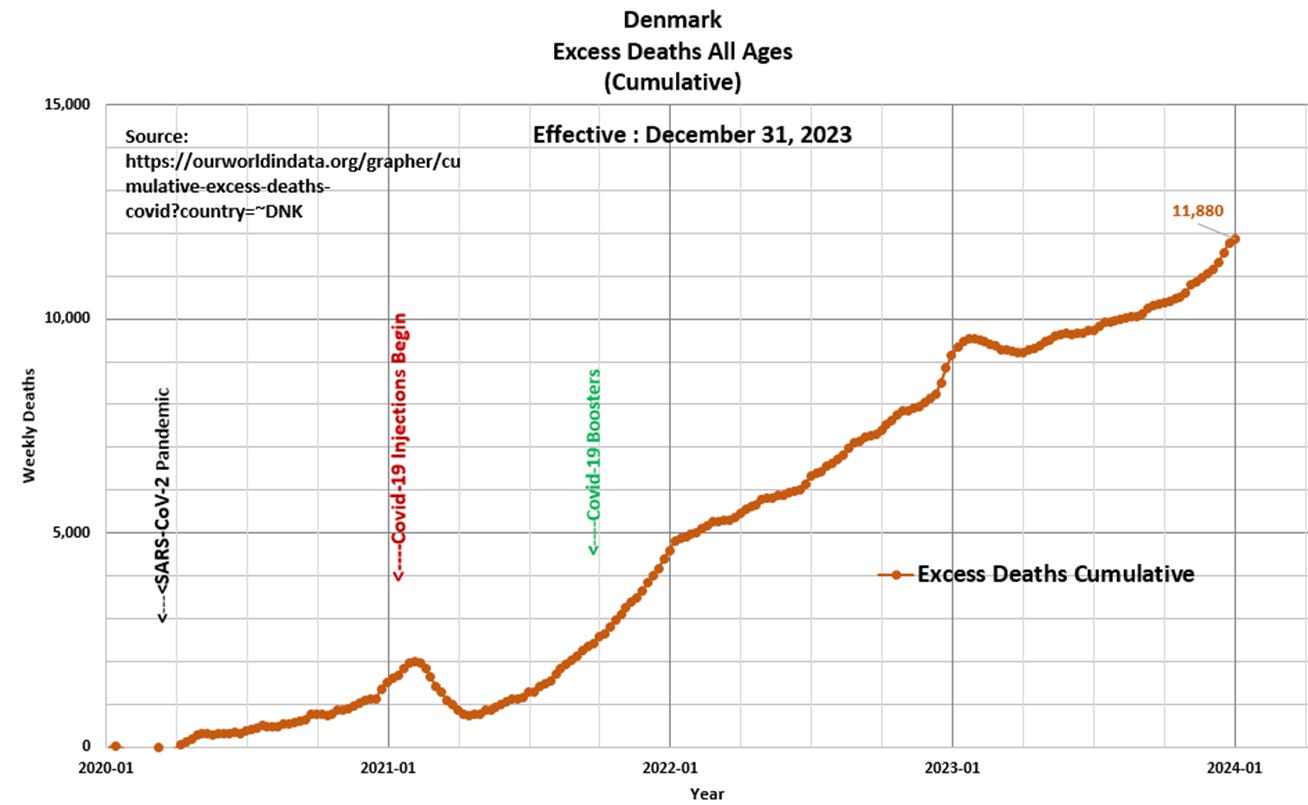
Panel 4 Based on the data and this author’s model, 11,880 Excess Deaths have occurred since the start of the pandemic. This compares to 10,503 Excess Deaths since January 2020 as per Excess Death Stats https://www.excessdeathstats.com/denmark/.


