by Eldric Vero
June 15, 2024
This CotD was inspired by the following:
1) BBC News Nov.30, 2021 “Greece to Fine over-60s who Refuse Covid-19 Vaccine” (see link: https://www.bbc.com/news/world-europe-59474808 ). As per the article: Fines of €100 (£85) will be imposed at monthly intervals from mid-January on those who refuse, Prime Minister Kyriakos Mitsotakis said. Mr Mitsotakis said the decision had “tortured” him but he felt a “heavy responsibility in standing next to those most vulnerable, even if it might fleetingly displease them”.
2) Sofia News Agency January 4, 2024 “COVID-19 Surge Greece Reinstates Indoor Mask Wearing Amid Rising Cases” (see link: https://www.novinite.com/articles/223361/COVID-19+Surge%3A+Greece+Reinstates+Indoor+Mask+Wearing+Amid+Rising+Cases ). As per the article: A surge in COVID-19 infections has prompted Greece to reinstate the requirement for masks indoors, signaling concerns about the escalating number of cases. Officials acknowledge mounting worries not just about the rising infection rates but also the relatively low vaccination coverage in the country. With an increase in hospital admissions due to the virus, Greece is taking precautions to curb the spread.
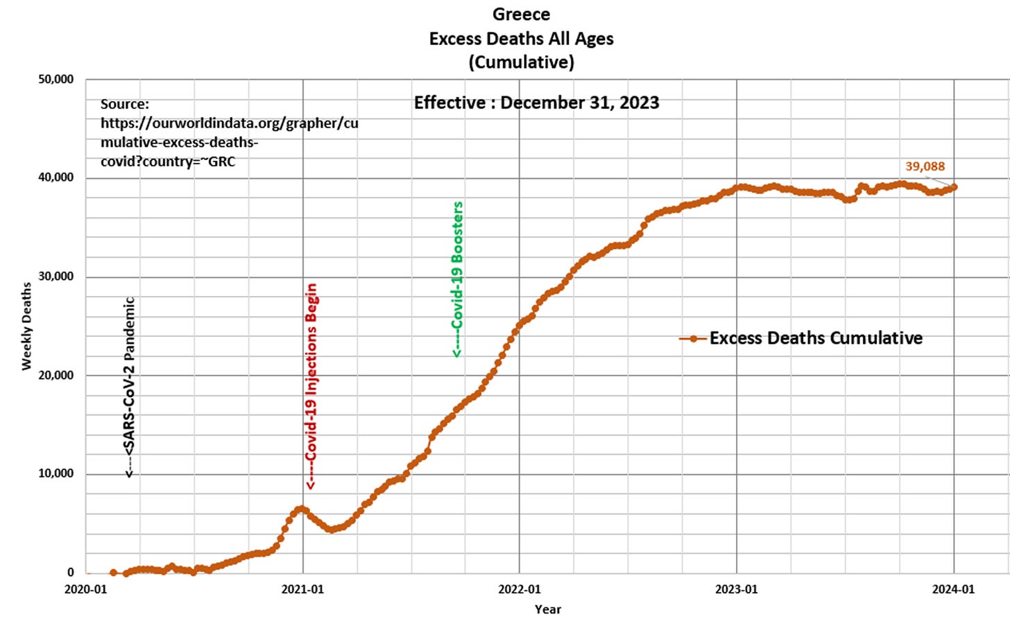
The author of the CotD has combined analyses of Covid-19 and Excess Deaths (all causes) as these are related.
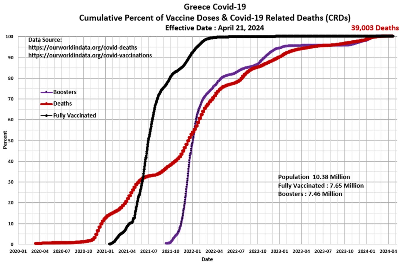
Panel 1 The first graph is a construct by the author as a standard CotD presentation which illustrates Covid-19 related deaths (CRDs) and vaccinations. The vaccination program began in January 2021 with little effect on the increasing death rate until about the second half of 2021 as the death rate subsided somewhat to a relatively low rate indicating the vaccine program “appeared” to be effective (over 70 percent of the population was fully vaccinated by then). The death rate increased again in Q4’2021 some 1 to 3 months after the booster program was initiated. The booster-to-death rate correlation is near 100 percent as both curves are essentially mirror images since January 2022, which is the most prolonged correlation period the author has analyzed to date.
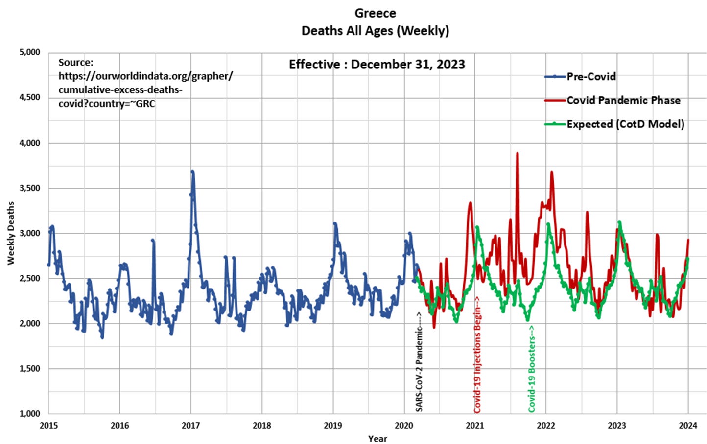
Panel 2 Observe the characteristic cyclical nature of deaths or all-cause mortality since 2015. The “Blue” line represents data prior to March 2020 and the “Red” line represents data since the SARS CoV-2 pandemic was initiated in March 2020. The “Green” line represents the “Expected” deaths (CotD Model) based on historical averages. The author has utilized the five year period January 2015 to December 2019 in order to calculate an average normalized curve for Weekly Deaths. The Expected (CotD Model) deaths incorporates an average 4 percent growth factor which appears to be a good match to the overall trend.
Panel 3 This presents the magnified portion (January 2020 to January 2024) of the graph in Panel 2. The “Orange” line represents “Excess Deaths” which is calculated by subtracting Expected Deaths from Official Deaths.
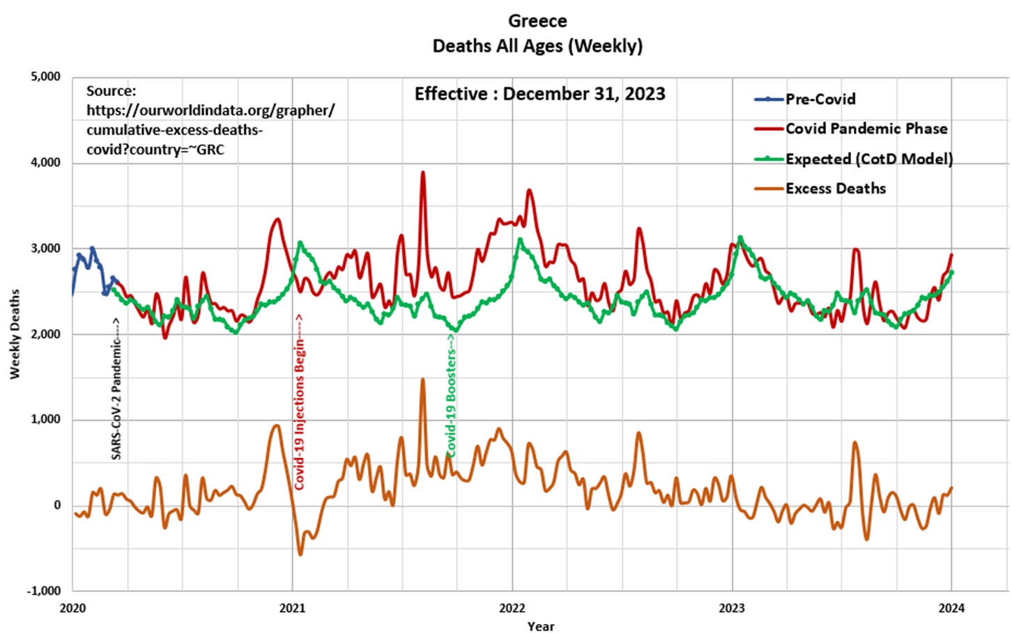
Panel 4 Based on the data and this author’s model 39,088 Excess Deaths have occurred since the start of the pandemic, of which 33,296 Excess Deaths (85 percent) have occurred since the start of Covid-19 injections in January 2021. This compares to 39,002 Excess Deaths since the start of the pandemic as per the ourworldindata.org website.
“Freedom is the sure possession of those alone who have the courage to defend it.” Pericles


