by Eldric Vero
June 25, 2024
This CotD was inspired by the following:
1) BBC News May 13, 2024 “How Covid-19’s symptoms have changed with each new variant” (see link: https://www.bbc.com/future/article/20240111-covid-19-how-does-its-symptoms-differ-from-flu ). As per the article: In the early months of the Covid-19 pandemic, reports of an unusual and baffling symptom of the disease began to emerge – patients were developing painful or intolerably itchy lesions on their feet and hands. These chilblain-like swelling and reddening of the skin became commonly known as “Covid toe”. Doctors and scientists were puzzled – how did a respiratory virus cause such a strange symptom in the body’s extremities? Another theory was that lockdown rules meant more people were just not wearing adequate footwear around their homes and too much time sitting still.
2) The Brussel Times June 20, 2024 “Covid-19 cases on the rise in Belgium since start of June” (see link: https://www.brusselstimes.com/health/1102531/covid-19-cases-on-the-rise-in-belgium-since-start-of-june ). As per the article: A total of 608 new Covid-19 infections were diagnosed between June 9-15, portraying an over 50% surge compared to the first week of June. In several European countries and the US, the new sub-variants KP2 and KP3, stemming from JN.1 and the “FLiRT” family, are seen as the main culprits driving the increase in positive Covid-19 cases.
The author of the CotD has combined analyses of Covid-19 and Excess Deaths (all causes) as these are related.
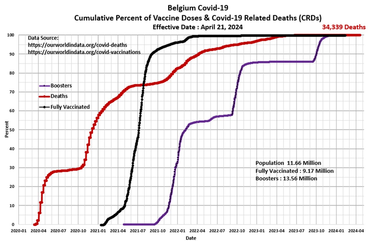
Panel 1 The first graph is a construct by the author as a standard CotD presentation which illustrates Covid-19 related deaths (CRDs) and vaccinations. The vaccination program began in January 2021 with little effect on the increasing death rate until about the second half of 2021 as the death rate subsided somewhat to a relatively low rate indicating the vaccine program “appeared” to be effective (over 75 percent of the population was fully vaccinated by then). The death rate increased again in Q4’2021 as the booster program was initiated. The step-like booster curve is associated with boosters 1, 2 and 3. The CRD rate has subsided significantly as the vaccine program waned since 2023.

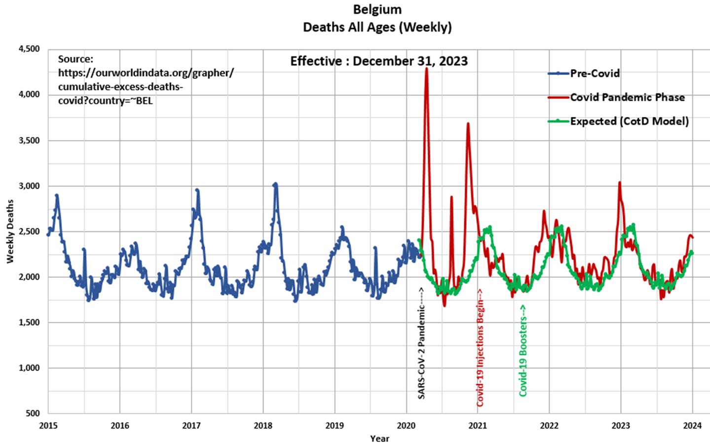
Panel 2 Observe the characteristic cyclical nature of deaths or all-cause mortality since 2015. The “Blue” line represents data prior to March 2020 and the “Red” line represents data since the SARS CoV-2 pandemic was initiated in March 2020. The “Green” line represents the “Expected” deaths (CotD Model) based on historical averages. The author has utilized the five year period January 2015 to December 2019 in order to calculate an average normalized curve for Weekly Deaths. The Expected (CotD Model) deaths incorporates an average 0.5 percent growth factor which appears to be a good match to the overall trend. Once again, interesting to note the spike in deaths in early April 2020 (less than a month after the pandemic was officially announced) and again in November 2020 just prior to the vaccine roll-out.

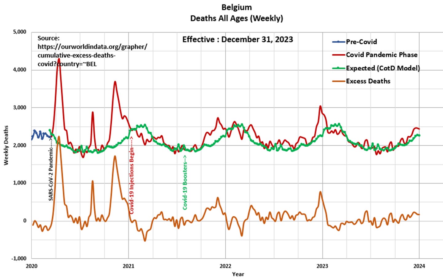
Panel 3 This presents the magnified portion (January 2020 to January 2024) of the graph in Panel 2. The “Orange” line represents “Excess Deaths” which is calculated by subtracting Expected Deaths from Official Deaths. Excess Deaths peaked at 2,239 during the week ending April 14, 2020, a month after the pandemic was officially announced.

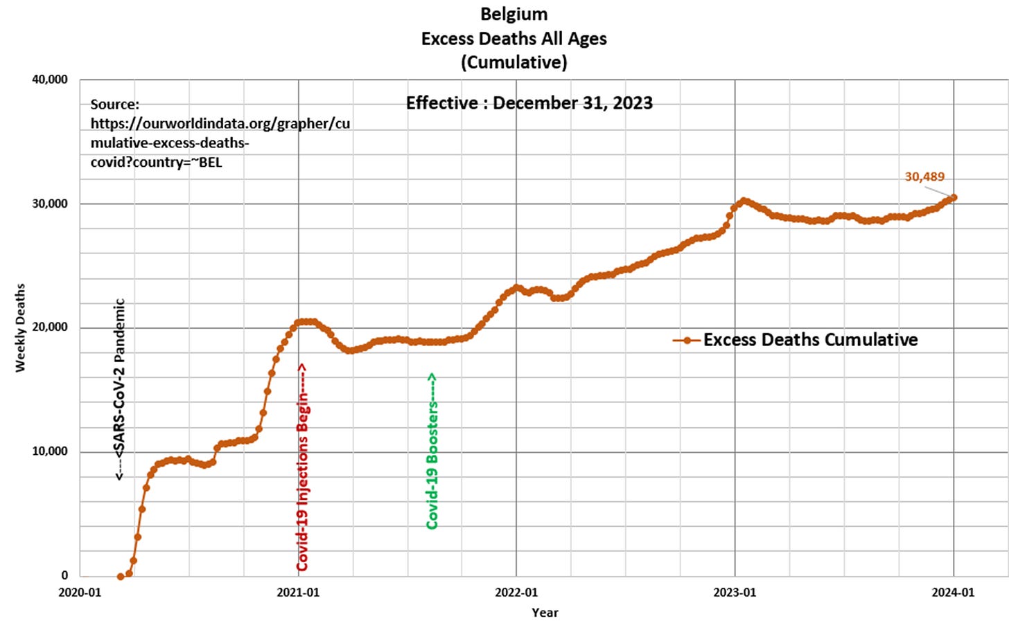
Panel 4 Based on the data and this author’s model 30,489 Excess Deaths have occurred since the start of the pandemic, of which 10,042 Excess Deaths (33 percent) have occurred since the start of Covid-19 injections in January 2021. This compares to 30,348 Excess Deaths since the start of the pandemic as per the ourworldindata.org website.

“Truth exists…only lies are invented” Georges Braque


